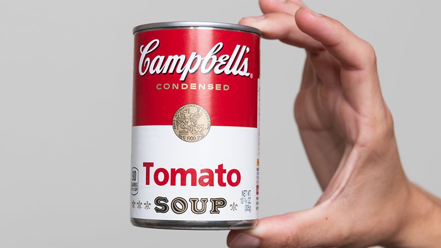
After using the same design for more than 50 years, Campbell’s officials have changed the labels on their soup cans — although only the company’s most observant customers are likely to notice.
While the red and white color scheme remains, the font of the Campbell’s logo has been slightly altered and a shadow behind the lettering has been removed, the company points out. Plus, the font used to print the word “soup” has been changed and the “O” in the word has been slanted as a nod to the company’s original soup label, the company reveals.
The labels on Campbell's soup cans are getting their first redesign in about 50 years. https://t.co/425xzfjnKM
— CNN (@CNN) July 27, 2021
In a statement released Tuesday, Campbell’s officials say the new label “evokes the same sense of comfort, goodness, and Americana” as the previous one.
Would you have noticed any of these changes if you weren’t told about them? How does making tiny changes to the label sell more soup?


